Data Visualisation Part 2

Today, I thought I’d have a look around to see what extra resources I could find to support the students doing the Data Visualisation Course at Southampton.

My favourite MOOC provider, FutureLearn, has a course that covers just this, so I went through it to see what I could learn.  Here’s the link to the course:  Big Data Visualisation.

Here is a list of the links I found to useful web sites, divided into sections.

Examples of data visualisation:

Ideas for Design and Evaluation (applies to so much more than data visualisation!)

You can download a free e-book ‘An Introduction to Data Visualization’ from here, via the accompanying blog ’16 Captivating Data Visualization Examples’ here.

Here’s another blog by people from Northampton University .  Among other interesting posts is one using using socioviz.net to extract data from Twitter, in this case based on #starwars.

Here’s some good-quality data from Australia’s equivalent of the MET office: Australian Government Bureau of Meteorology.

And here’s some stunning work, using WebGL, just because.  Enjoy!

Tools for Data Analytics & Visualisation

I’ve been asked by one or two people to recommend websites and tools to help with analysing data and visualising the results.  Here we are.

First of all, the best set of environments to write and test code is provided by Anaconda.  This suite of tools is quite large in terms of the amount of hard disk space it occupies, although you can load the modules separately.  It’s built for Python, but it also includes R which is often the coding language of choice to build data visualisations.  It’s become the industry standard, and I’ve seen plenty of academics using it.

I’m especially fond of the Orange component which might at first glance look to be a bit of a ‘toy’ application.  While it offers drag-and-drop functionality to bring in data and create a chain of analytical steps to use on the data, all the power of Python and algorithms from scikit-Learn are working in the background.  The only thing ‘toy’ about it is the representation of many lines of code by an icon.

Orange is backed up by a good set of blog posts that cover most of the things you can do with it.  However, when it comes to learning how to write code to do specific projects, there are a few web site tutorials I found indispensable (I’m assuming a basic knowledge of Python already).  I’ll just list them here (these are Python based unless stated otherwise):

This site is good for links to various tools, especially when it comes to data visualisation:

I’ll try and add to this blog as and when I come across (or remember) other useful sites, and I haven’t even mentioned books yet!

I will also be posting some of my code on GitHub – this will be code to harvest text data from blogs, clean it up, pre-process in and analyse it using topic modelling and classifiers, followed by different ways of visualising the data.

What I haven’t included here are links to video tutorials.  I don’t get on with video tutorials.  I prefer to work my way methodically through my data problem, and I find voices (and usually inadequate screen-capture videos) incredibly annoying.  If you’re a young person reading this, sorry.


Revealing a Network

In my previous post, I finished with a very brief criticism of using AI to replace the traditional search using Google or similar.  The unreliability of AI is a popular topic at the moment – I read ‘Weapons of Math Destruction‘ by Cathy O’Neil not long after it was published, and there are now many more books and journal articles covering the subject.  The best way for me to explain my reservations is it terms of my own research.  I am trying to uncover the topics discussed by teacher bloggers, and to see if the things they talk about have changed over time.  To do this, I’ve harvested many thousands of posts, and am using algorithms to help me categorise them.

There are different approaches to this, but one of the most straightforward is to use a word count.  Basically, the words that appear most frequently in a text probably indicate the topic being discussed.  However, the first step is to reduce the words used in the entire corpus – ‘noise’ words like ‘and’, ‘but’, ‘so’.  I can also go on to remove other words that don’t appear to be adding any value – in the case of teacher blogs, this might be ‘thing’, ‘year’ or ‘week’.  But every time I remove a word, there is a ripple effect across the entire corpus that I cannot see and evaluate because the set of data is too large to trawl through manually.  I am blind, and can only accept the results the algorithm presents me with.  If we can accept that leaving AI to trawl through publications and deliver the ones we have said we want to us, knowing that there may be some it has missed and be prepared to re-train the AI or run a ‘traditional’ search from time to time, then fine.  But we cannot trust the AI entirely.  Even if it provides two lists – the one it is confident we want (i.e. the one with the best probability scores), and a second list of ‘maybes’ (with lower probability scores) and, by picking some items from the second list we help it to ‘learn’, we still need to be mindful that the paper with the lowest probability score may be just what we were looking for.  AI doesn’t yet understand language, it can only turn words  into scores.

Secondly, I referred to using social networks to reveal communities of interest.  I was hoping to do this with a good example from the Art world, but here my domain knowledge is lacking and it would take me more time to identify some key names.  It’s worth mentioning here that ‘key names’ doesn’t necessarily mean ‘top names’.  It’s my experience that the people at the top of their field don’t have time to dabble with social media or write blogs, but they DO publish papers and write journal articles, both of which are discoverable.  Just to run ahead for a moment, the one young artist I did pick up on, Alannah Cooper,  uses Instagram.  The problem with Instagram is that it’s owned by Facebook and is a ‘closed shop’ for researchers.  Nevertheless, the URL can be recorded.

Anyway, to return to Social Media, in order to construct an example of how straightforward it can be to extract a network, I chose to use Twitter and searched using a phrase that has been doing the rounds recently ‘flattening the grass’.  It refers to an Edu-Twitter ‘scandal’ about a school who give students a very stern talking to in assembly, possibly even calling out the names of individual students who need to stop mucking about and actually do some work.  Or words to that effect.  It caused a bit of a storm, and was picked up by TES. The graph generated from the results is shown here. I’ve also included a graphic below, which is a bit small I know, but if you want to download the original file and zoom in for a better look it’s also here.

GraphImage2

The grouping algorithm behind this has made clusters based on their links with one another.  The core cluster is Group 1, with smaller groups and unconnected accounts shown on the right.  Profile information is also collected, and I could have removed everyone who didn’t identify as a teacher.  However, not everyone discloses their profession, and as this is ‘my’ community I recognise one or two names that don’t immediately declare themselves to be Educators.  The top influencers are the TES, and Paul Garvey (Groups 2 and 1) – the TES because they published the story (which broke originally on Twitter a week or so before) and Paul because he’s been actively engaged in any debate that centres around discipline and behaviour management.

Using my personal access to Twitter does restrict the number of results I can get (and producing a graph draws heavily on the processing power of my laptop, even though it’s quite a high specification) but the University of Southampton has its own access to the Twitter stream and bigger and better things could be produced.  As well as the graph, I now have a collection of Twitter IDs, links to individuals web sites and blog URLs, and other data such as any hashtags used.  All of this data can be used to expand the network and extract other members of the community.  It is also entirely possible that, as well as being able to discover the public writings of artists and designers, photographic evidence of their work would also be revealed if they have provided it.

What we won’t get, of course, is people who don’t use social media in any form, but we may still pick up names that can be linked back to publications.

To finish then, let me summarise these last two posts thus: the Arts deserve their own ‘Web of…’ to support their work, improve funding, and highlight the work of outstanding individuals in the field; wherever possible this should include examples of work (or work in progress) recorded digitally; writing (and images) by the artist/designer posted on the Web can represent a powerful archive for the community and the work of future historians and curators and should be documented in some way; AI has some potential to improve the way we search for artefacts; tools from computer science can be usefully deployed in the search and gather process.

Building a Web

I’ve recently got involved in a very interesting project which is looking at ways in which research is recorded and stored, and how to build the academic profile of the author(s) for the benefit of them and the University in which they studies / researched / work.

All universities keep a repository of published work generated by students, researchers and staff.  On some university web sites, it’s easy to find and relatively easy to search; by author, title, faculty or year of publication.  However, that said there were two universities where I gave up trying to find their repository.  It’s important for Universities to make this work discoverable because of the Research Excellence Framework – the REF.  Very simply, this is a way for universities to be assessed on the quality of their research: the higher the quality, the better their score, the higher their ranking, the more students they can attract, the more funding they get, the easier it is to apply for additional funding…. you get the idea.

As a researcher, I use Google Scholar to find papers and journal articles to read and cite in my own work.  I pay attention to the citation scores – for the over-arching topics (in my case, this would be something addressing a definition of Web Science) – it’s clear that some publications are cited far more often than others, and I would need to include them.  However, not all interesting or relevant papers are cited frequently, or indeed at all.  Not everything that’s published has the references scrutinised for citation counts.  PhD’s, for example, aren’t looked at, and not all journals will see their publications ‘counted’.   I need to be aware of this when I do my own research, and critically review a wide range of sources whether cited or not.

The Web of Science does a similar, but provides more sophisticated ways to search for papers and articles.  It’s basically a much more integrated search engine and subscription service, run by commercial company Clarivate Analytics.  I’ve no reason to doubt that it’s a successful model that’s been helpful to publishers, academic institutions, authors and researchers alike.  And let’s not forget that the sciences are well-funded and can absorb the costs.

The project I am working on is exploring the idea of something similar for ‘the Arts’, by which I mean….. what?  In the absence of a clear definition at this early stage, I’m thinking of it in terms of research into Art and Design (including architecture as ‘conceptual design’) that may (or may not) result in a practical production piece.  I have already alluded to one challenge for building a ‘Web of Arts’: that of finance.  The second challenge arises when the result of research is both a written piece and a piece of work that may be a large sculpture of series of textiles.  Is this data stored, and if so how and where? Do universities only archive degree shows, or other works that make a public impact?  We should also consider curated exhibitions: and exhibition of works of any kind and by any artist(s)/designer(s) could be considered a publication in itself, even if there are no ‘spin-off’ books or articles.  Some scholars and students (and their universities) are very good at keeping their web site profiles up to date with all their work.  Others aren’t.  Of course this applies to science-based academics as well, and it would be an interesting exercise to find a way of evaluating how effective and equitable universities are at keeping scholars, researchers and academics across all faculties ‘promoted’.

My own background, I think, dovetails nicely with this project.  My first degree with the OU was in English Literature and Art History.  I then went on to teach English, and was Head of Media at a large comprehensive school.  I taught Media Studies at KS3, 4 and 5 (‘O’ and ‘A’ level).  I now find myself completing a PhD that draws heavily on computer science (I’ve had to learn to code in Python and use a range of algorithms to clean, process and analyse data).  I’m an enthusiastic supporter of CS for women and girls, but I also have a love of the Arts including film and media, plus advertising and marketing.  So, let me make some statements:

  • the Arts are as important as Science, and we should approach them in terms of their academic integrity by assuming they are equal.

By this I mean that, if the Web of Science is worthy of a subscription service such as that provided by Clarivate Analytics, then so are the Arts.  A Professor of Computer Science should have  the same status (for want of a better word) as a Professor of Film Studies.

  • Practical work produced from work in the Arts is no different from lines of code, or an application, produced from research in CS.

Moving on from here, what the Web of Science has done is make it possible to identify top researchers as well as top papers.  From my own experience, certain names in the CS field occur more often than others, and so a sense of the ‘top names’ begins to develop.  This is something that a WOA might exploit further.  My research focuses on the community of teachers and other educators on Twitter, where may well-known names in the field of educational research regularly post and have participated in the construction of a network of people all connected by Education.  I was fortunate in that someone else from the Edu-community had created a spreadsheet of members of the community, so finding the bloggers I needed for my research was easy; however it would be relatively easy to create something similar to identify key names from the Arts.  People write blogs that have a URL (a web address), their blogs are read by other members of the community who may leave comments that also have a URL, they read the blogs of others that they may include in a list on their own blog home page (a blogroll) or link to in the text of their blogs.  These can be harvested and used to build a network.  If they use Twitter, so much the better as Twitter makes it relatively easy for researchers to access data.  The ‘user profiles’ (or ‘about’ pages for a blog) can help identify the people that should be included in the network.

As well as revealing a network of connected individuals (a web of arts), the content of posts is also potentially interesting.  When I did my first degree, I remember a thick text book that contained extracts or writings by artists and designers, and other things like the Dada Manifesto.   These have been preserved because, of course, they were written and published on paper, even if they were in the form of personal diaries or letters.  In the twenty-first century, it is entirely possible that similar personal writings are now online, existing in the ephemera that is the web.  I have found several blogs written by computer scientists incredibly useful.  I keep my own blog here as a way of recording my thoughts and ideas prior to writing them up more formally.  Curating links to blogs and tweets from the Arts community would surely be of as much interest as formal publications, not least of which because they may also include digital images of recent work.  Other platforms that may host items of interest would include Pinterest, Facebook and Instagram, although the latter two (Instagram is owned by Facebook) can’t be accessed with ease and it is entirely likely that only a record of the URL would be available.

Finally, a recent article in Forbes suggested that searching a database, whether it be Google or a publication-database service such as Pubmed in the conventional way i.e. typing a set of relevant words and clicking on the magnifying-glass icon, might be superseded by an assistant with Artificial Intelligence.   I’m a little sceptical here, mainly because AI still relies on the prompts and clues we give it.  It learns from these, which means we are in danger of ending up in an echo-chamber of our own making.  We must always retain the ability to make ‘left-field’ choices; to pursue the seemingly unrelated paper because it looks interesting; to go beyond the first few pages of our search results; to expand or contract our sets of key words as we see fit.  AI has been shown to be remarkably dumb in some circumstances if we let it make decisions for us.  In short, I’m still not convinced of its ‘intelligence’, artificial or otherwise.

In the next post, I’ll try and give some examples of what a network from Twitter looks like as a graph, and the kind of useful information we can obtain from it.  I’ll do this using a network I already know (Edu-Twitter) and see of I can construct something similar from the Arts.


Topic Modelling. It’s Hell.

Now I’m on the last chapter of my PhD (ok, so the other three still have some things I have to add, but hey-ho), it’s time to face up to the challenge of topic modelling.

The good thing about topic modelling is it’s a clustering problem: it assumes you know nothing about your data, and wants to find out what people have been writing about.  Actually, what topic modelling is, is the application of the Latent Dirichlet Application algorithm which assumes that if you know something about the words in the corpus, you can work out what the topics are.  It also assumes that all the documents belong to all the topics, but the probability for some documents belonging to all the classes will be 0, or very, very close to 0.  The bad thing about topic modelling is that is assumes you know nothing about your data, and therefore will lie to you unless and until you treat it properly: feed it clean data, restrict the calorie intake of the data by removing anything unnecessarily fatty or sugary, and tell it how many topics you actually want it to find.  But hang on, you don;t know anything about the data, right?  So how can you possibly know what to look for?  And the topic modelling algorithm just sits quietly with a smug grin on its face.

In the space of ten years or so, the computer science community, or at least the bit of it that’s tried to wipe the smug grin off its face, has gone from ‘look! It’s a miracle!’ to ‘this thing just LIES and LIES and LIES….’.   Some attempts have been made to try and address the problem, but they are computationally expensive, or the code hasn’t been incorporated into the popular algorithms yet, and so the non-computer-sciency person like me is left trying to work out the best method of making the bloody thing work.

And that’s the real issue: there’s a line between ‘making it work’ and ‘fiddling the figures until you get what you’re looking for’ that must not be crossed.  Not if you want an examiner to believe your research, anyway.  And it turns out there are a thousand ways to tweak the data / the parameters of the algorithm / both together to ‘make it work’.

Ultimately, the goad is to uncover “….better topics that are more human interpret-able” but even if you know the domain from which your corpus has been drawn, this can still be challenging.

So, the general consensus in all research papers I’ve read seems to be that the data needs to be cleaned up (URLs removed, contractions expanded, punctuation deleted etc.); stopwords removed (including any additional words that are particular to the corpus); and the corpus tokenised (each word is now a token, not a functional part of a sentence).  Some papers advocate stemming – reducing words to their root form – other’s don’t mention this at all.  Stemming reduces the overall number of tokens as words like ‘teacher’, ‘teaching’, ‘taught’ become ‘teach’.  The next step is then to produce a matrix of word count vectors – the number of times every word in the entire corpus is used in each document.  That’s potentially a lot of zeros, which is fine.  Having done this, it’s possible to go one step further and add a weighting to each word so that that count is now in inverse proportion to the number of documents its used in.  In short, the least frequently used words get higher ‘scores’ and become more important as a way of signalling a particular topic.  The 232 documents in my trial set of data (blog posts, in case you haven’t read anything else I’ve written) contain 7,047 unique tokens.  That’s a matrix (table, if you like) of 7047 x 7047 word counts of TFIDF scores.

If I use a simple count vector and ask the algorithm to find 8 topics (a lot of trial and error suggested that this might be the optimal number.  Don’t ask. Let’s just say it was a lot of running and re-running code), plus stemming and tokenising, the spread of topics looks like this:

CVV3

What you’re looking at here is each of 8 topics ‘clustered’ in two-dimensional space (principal components 1 and 2).  The top-30 most-used are shown on the right.  The same parameters, but this time using TFIDF, are shown here:

TFIDFV3

It looks a bit different.  One topic dominates all the others.  What makes this all more than a bit annoying is that every time the algorithm is run, the results are slightly different, so anyone wedded to 100% accuracy and replicability is going to be apoplectic very quickly.  Nevertheless, if you can take a deep breath and get beyond this, it’s entirely possible that what is being shown as a reasonable representation of the topics in a corpus as a result of the decisions made on the way to the final convergence of the algorithmic process.  It’s not ‘true’, but it’s ‘true for a given value of true’.


If anyone wants to have a look at the interactive files, they’re here in my GitHub.  You’ll need to download the files, and then open them using a browser.

As well as trying this out on data that’s been stemmed and tokenised, I also tried using just a count vectoriser.  You’ll find the files by clicking on the link above.

The verdict?  Well, the goal is to be able to add a meaningful label to each cluster.  I haven’t had a really close look at them yet, but first glance suggests applying a simple count vectoriser, and only tokenising the data, seems to produce the clearest results.  In the end, the method I choose to arrive at the results has to be consistent, and once I’ve decided what it is going to be, I have to accept them as they are, because I have to repeat this on 14 sets of blogs.  It’s also entirely likely that, for some years, there will be more than 8 topics (or less) so there will still be some faffing around in terms of topic numbers, but that will be it.  Everything else will stay the same.

Houston, We May Have A Problem….

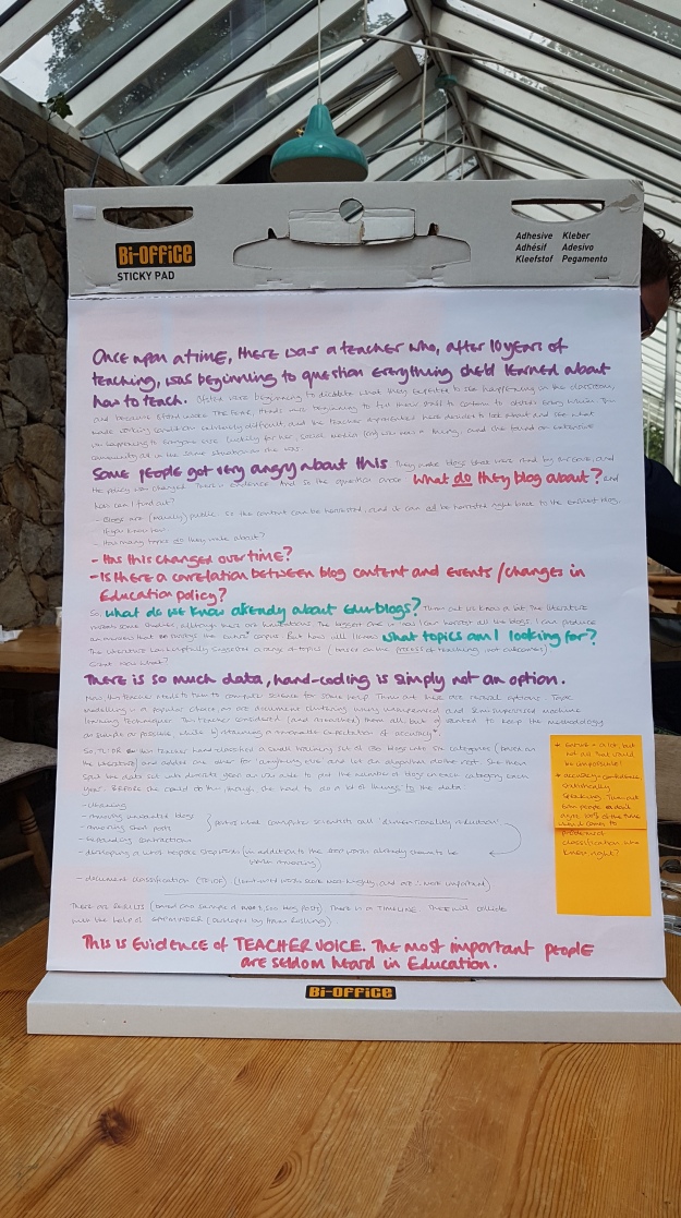
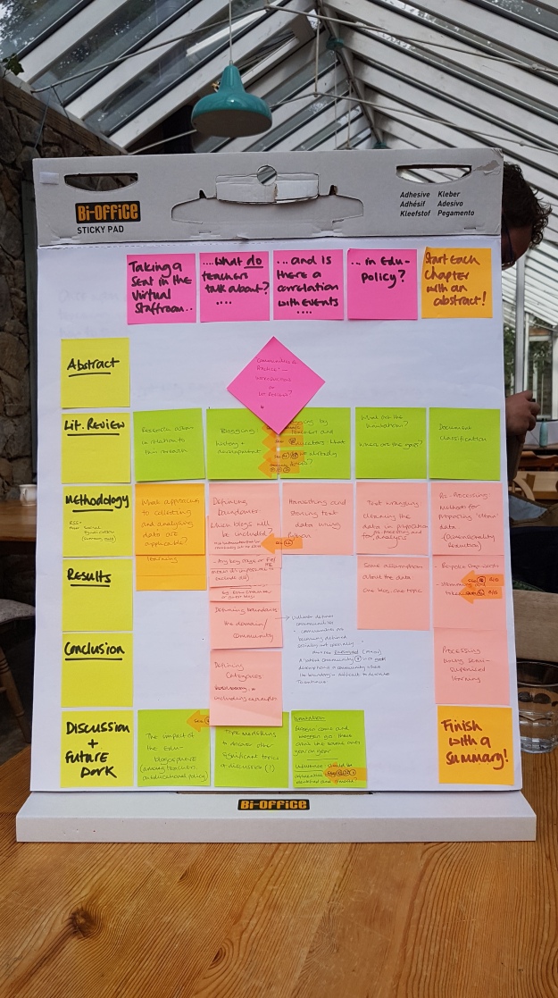
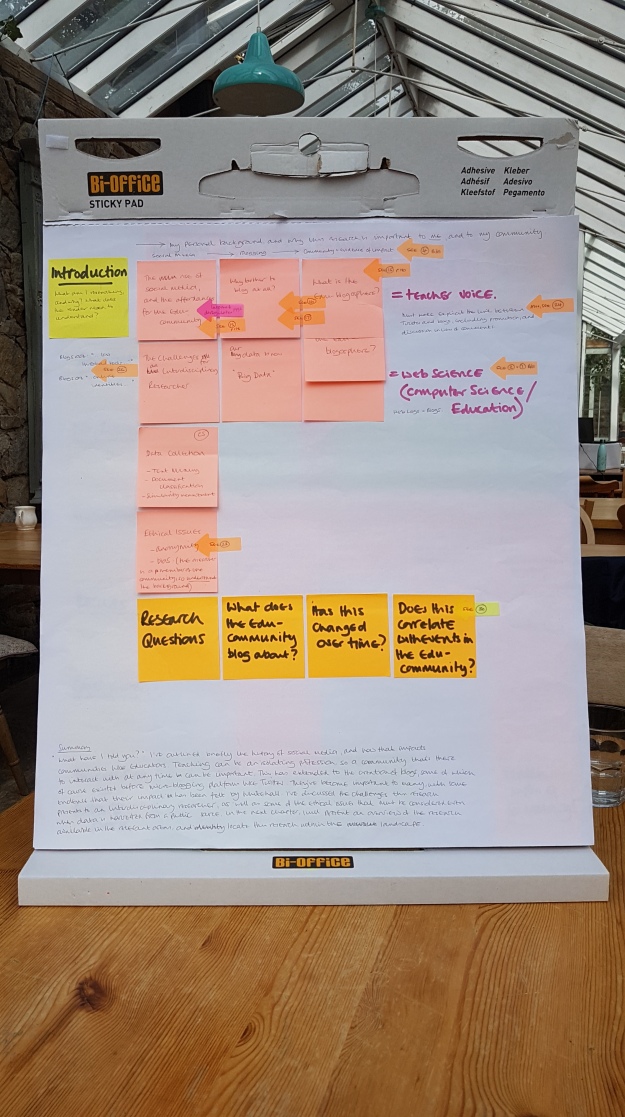
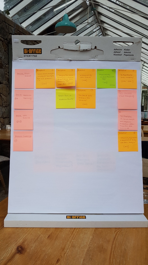
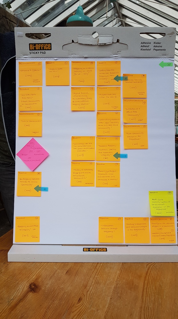
I’ve been writing up my PhD.  This has been a very slow process, mainly because I’ve had to spend quite a bit of time going back through all my references, and re-planning the whole thing.  I bought post-it notes, and a tabletop flip chart (which is also like one massive post-it), and I’ve re-appraised everything.  As I write, I’m constantly adding more post-its as prompts of things I need to look up / do / add to the ‘discussion’ section at the end.

One of the things I decided I’d do was go back through my original data to make sure that I’d gathered everything I needed to, and to see if I could improve the cleaning-up process.  In computer science circles, this is often referred to as ‘text wrangling’.  Your typical blog post contains URLs, other advertising rubbish that’s added by the platform, junky unicode, characters representing carriage returns, new lines…. I could go on.  This all has to be removed.  A text data file, when its being prepared for analysis, can get very big very quickly – and there’s a limit to the data file that even my pretty-well-spec’d laptop can handle.  Having discovered this excellent site, I can not copy and paste a section of a blog post with some rubbish in it, and generate the code snippet that will remove it.  Regex can be tricky – the broader the parameters i.e. the greater freedom you give it to remove the stuff you don’t want, the more chance there is that it’ll remove other stuff you really would have preferred to keep.  It’s difficult to check, though, so in the end you probably have to just take the risk.

The other thing I wanted  to do was expand the contractions in the posts so that ‘isn’t’ becomes ‘is not’ etc.  I think it’s important to leave behind a data set that may be useful to future researchers, some of whom might be interested in sentiment analysis.  Expanding contractions helps to keep the meaning of the writing intact.

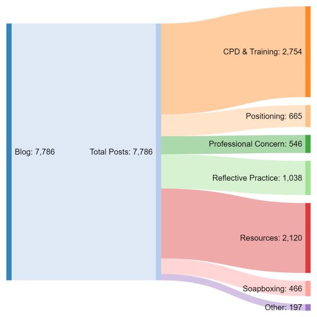
Then, I decided I’d go back and look again at how I’d processed my data.  As you may recall, my aim is to classify as many edu-blogs as possible according to a pre-defined list of categories drawn from the research that’s already been done on what teachers blog about.   I chose this approach because the potential number of topics is completely unknown, and  potentially huge.  It’s possible to run an algorithm that will cluster blogs without any prior information, but the trouble is that a) you still have to give it some idea how many clusters you might be expecting, and b) the results will vary slightly each time it’s run.  Its not a model; there’s no consistency.

One of the alternatives is to label a small set of blog posts with numbers representing categories, and then use an algorithm that will take this information and classify the unlabelled posts.  This is how it works: imagine having a double handful of brown smarties and a clear perspex box, say 1m x1m.  You throw the smarties into the box, but by magic they remain stationery, but scattered, in space. Now you have a small number coloured  smarties, several of the remaining colours, and you chuck them in as well.  They also hang in space.  The label spreading algorithm assumes that the coloured smarties are the labels, and it sets about relabelling all the brown smarties according to how close they are to each different colour.  You can allow it to change the colours of the non-brown smarties if you want, and you can give it some freedom as to how far it can spread, say, the red colour.  The algorithm spreads and re-spreads each colour (some of the different coloured smarties will be quite close to each other…. where should the boundary be drawn?) until it reaches convergence.

The picture here (and above) is a great example.  Not only does it look like a load of smarties (which I’m now craving btw) but it also perfectly illustrates one of the fundamental problems with this approach – if your data, when plotted into a 3D space, is an odd shape, spreading labels across it can be a bit of a problem.  The algorithm draws a network (there are lines connecting the smarties if you look closely) and uses the links between the smarties – officially called ‘nodes’, links are ‘edges’ – to determine how many ‘hops’ (edges) it takes to get from your labelled node to your closest unlabelled one.

Each of these nodes could represent a blog post.  It has co-ordinates in this space.  The co-ordinates are generated from the words contained in the post.  The words have to be represented as numbers because none of the algorithms can deal with anything else – this is maths territory we’re in, after all.

I’ve one this label spreading thing before with a sample set of data.  It seemed to work ok.  A quick audit of the results was promising.  I had another run through the code with a different set of data, including the training set I’d developed earlier, and realised that things weren’t quite the same.  The algorithm has had a bit of an upgrade since I last deployed it.  There were some issues, and the developers from scikit-Learn made some improvements.  That got me re-thinking what I’d done, and I realised two things: I’d made a fundamental error, and the new results I was getting needed a bit of an audit.

The book on the right has been invaluable!

The fundamental error really shows up how hard it is to do data / computer science when you aren’t a data / computer scientist.  I was feeding the algorithm the wrong set of data.  I should have been feeding it an array of data based on distance, but I wasn’t.  I was still getting results though, so I didn’t notice.  The thing is, nowhere is there anything that says ‘if you want to do this, you must first do this because this’.  It’s just assumed by every writer of computer science books and blogs and tutorials that you know.  I went back and re-read a few things, and could see that the crucial bit of information was inferred.  I can spot it now I’ve gained a lot more knowledge.  So, fault corrected, move on, nothing to see here.

The audit of results isn’t very encouraging, though.  There were many mis-categorisations, and some that were just a bit…. well… odd but understandable.  One of my categories is ‘soapboxing’ – you know, having a bot of a rant about something.  Another is ‘other’ to try and catch the posts that don’t fit anywhere else.  Turns out of you have a rant in a blog post about something that isn’t about education, it still gets classed as ‘soapboxing’, which makes perfect sense when you think about it.  An algorithm can’t distinguish between a post about education and a post that isn’t, because I’m thinking about concepts / ideas / more abstract topics for blog posts, and it’s just doing maths.  Post x is closer to topic a than topic b, and so that’s where it belongs.

There are other approaches to this.  I could use topic modelling to discover topics, but that has problems too.  ‘People’ might be a valid topic, but is that useful when trying to understand what teachers have been blogging about?

My label spreading approach has been based on individual words in a blog post, but I could expand this to include commonly-occurring pairs or trios of words.  Would this make a significant difference?  It  might.  It would also put some strain on my laptop, and while this shouldn’t necessarily be a reason not to do something, it’s a legitimate consideration.  And I have tried tweaking the parameters of the algorithm.  It makes little difference.  Overall, the results aren’t different from one another, which is actually a good thing.  I can make a decision about what settings I think are best, and leave it at that.  The problem, the real problem, is that I’m working with text data – with language – and that’s a problem still not solved by AI.

What I cannot do is make the data fit my outcome.  Worst case scenario, I have a lot to add to the ‘discussion’ part of my PhD.  If I can come up with a better analytical framework, I will.  The hard work – harvesting and wrangling the data – has already been done.  If I have to find some more papers to add to the literature review, that’s no hardship.  In the meantime, I’ve slowed down again, but I’m learning so much more.

Kicking Off The Actual Writing

For the last two days, I’ve been up NORTH at a writing retreat, organised by the DEN, and held here.  I’ll add a link to my photos, but I’ll put this one here because it sums up the place perfectly!

20180612_105025

I got loads of work done, as you can see.  I love technology, but sometimes you have to get the stationery out and do it the old-fashioned way.  Besides, who doesn’t love stationery, amiright?

20180612_162151

The narrative…

20180612_162216

The overall structure, minus the Introduction (which is next)

20180612_162237

The Introduction

20180612_162255

Starting the Literature Review, and some extra thoughts….

20180612_162128

….and the Literature Review specifically focusing on the blogosphere!

University of Shanghai Datathon (March 2018)

It’s taken me longer than usual to write this blog post.  This is partly because I’ve been very poorly since returning from China (the Doctor thinks I may have picked up a viral infection on the plane on the way home), and partly because the trip was very different from previous ones.  The purpose of this trip was to participate in a Datathon, with one day scheduled to have a look around Shanghai.  As it turned out, spending four days exploring data with other students was an absolute joy, and I was able to use many of my skills and the data processing tools I’d gathered which made the whole experience a really positive one.  The group of students I was working with – Hello if you’re reading this! – were absolutely lovely, and they looked after me really well.

My lovely group: Richard, Christie, and Eric. Our presentation is in the background!

The hotel where we were staying was within the University campus (I think I’m right in saying it’s actually owned by the University of Shanghai), which itself is a 50-minute journey by subway to the city centre.  I wish I’d taken more pictures of the campus, which was large, open and airy, with lots of green space and gardens (all my photos are here).  The computer science building where we were based was a few minutes’ walk away.

The data we were given to work with included some from the NYC Taxi and Limousine commission.  This is a huge set of data that people have already done some amazing – and silly – things with like this which shows that you can make it from Upper West Side to Wall Street in 30 minutes like Bruce Willis and Samuel L Jackson.  The theme of the exercise was ‘Smart Transport, Our Environment, and More’, which is a very hot topic at the moment, especially driver-less vehicles.   The University of Shanghai is conducting a lot of research on autonomous vehicles, including transport by sea.  We were given one year of data to work with, but even when this year was broken down into months, the size of the files made it impossible to work with on a laptop.  While my group worked on the main project, I drew a 1% sample of January 2013 to work with, the largest sample I could extract and still be able to process the data.  I’ve included a few images here, which were generated using Orange (part of the Anaconda suite) which I’ve  blogged about previously.

Passenger count – mainly – Surprise! – single person journeys.

All three groups in the Datathon converged around the idea of predicting where taxis would be in highest demand, and at what times.  There’s a link to our presentation, data and code here, and the work of the other groups can be found here.  I particularly liked the work on ‘volcanoes and black holes’, which is basically the same problem, but visualised differently.


James with a couple of his group. That’s part of the ‘volcanoes and black holes’ presentation from Jon’s group behind them.

The other two PhD students – Jon and James – were both really good coders, which was just as well as the students they were working with were less experienced in this area.  In my group is was the opposite – they were able to crack right on with writing the code, while I did some of the ‘big picture’ stuff and helped with the presentation.

The nice thing about working with geo-tagged data is that is can be used to generate some lovely graphics.  These can tell you so much, and prompt other questions, like for example why don’t more people share a cab, and what would it take to persuade them to do so?  Even so, and although I haven’t been to New York, I do know that you have to know more about the location than a map and data will tell you.  You also have to know about people, and the way they behave.  Nevertheless, this is a fascinating open data set, which is being added to every year.  Similar data would be, I believe, easily available in Shanghai and other cities in China, and no doubt will be used in similar research.

Here you can see all the journeys from my sample plotted on a map.

2-6 passenger journeys. The larger the circle, the further the trip.

We all presented our work on Monday, 26th March in front of Professor Dame Wendy Hall, Professor Yi-Ke Guo, and Dr. Tuo Leng.  I know they were impressed with what had been achieved, and I think all the students (us included) gained a lot from the experience.  This is my second trip to China, and I have to say it made a huge difference being able to do something with the data.  In my (limited) experience, unless you’re a naturally gregarious person, it can be difficult to get fully engaged when some of the people you’re working with don’t speak English very well, and/or are reluctant to speak.  Fortunately for me, my group were both good English speakers, and happy to chat while working.  For Jon and James, I think the students with them were less chatty, but the fact that the guys could write code helped to break down those barriers.  the fact that I could code, and had some useful data analysis tools I could draw on, made all the difference.  I felt more confident, knowing that I could make some useful contributions.  Of course, Shanghai is a more cosmopolitan city than Shenzen, which probably makes a difference.

To sum up, then, this was a proper working trip which turned out to be both interesting and informative.  I met some lovely, lovely people and had a brilliant time.  I even managed to find plenty of vegetarian food to eat, and proper coffee.  I’m glad I’m not a vegan, though.

So, What DO teachers talk about?

So, having put the final piece of the coding jigsaw in place, here are the first set of results.  The diagram below represents a set of 7,786 blog posts gathered from blog URLs.  The earliest is 2009, the latest 2016.  They’re currently a  lumped in together, although in the end the data set will be a) much, much larger, and b) broken down by year (and normalised so that a proper comparison can be made).

There are lots of things going on here – how I’ve defined the categories; how I initially categorised some posts to form a training set; how the algorithms work and were applied to the data; in spite of what some people will tell you, data science has all the appearances of giving nice, clear cut answers when in fact the opposite – especially when dealing with text – is often true.

The journey to get here has been long and challenging.  Still, I’m happy.

blogs